What if the secret to doubling the perceived size of your HDB flat wasn’t knocking down walls, but simply aligning the undertones of your surfaces? It’s a common concern for Singaporean homeowners who fear that a bold design choice might leave their living room feeling cramped or cluttered. You want a home that feels open, airy, and expensive without the risk of your style looking dated by next year.
Mastering the art of coordinating wall and floor colors is the most effective way to create a balanced, professional-looking interior. We understand that choosing between hundreds of vinyl patterns and paint swatches can feel overwhelming. This guide simplifies the process, helping you master the spatial tools needed to “expand” your square footage through color theory. We’ll explore the 2026 shift toward warm modernism and biophilic design, providing you with a clear roadmap to select a vinyl flooring and wall pairing that looks cohesive. From identifying tricky undertones to applying the latest Japandi trends, you’ll gain the confidence to create a bright, high-quality space that stands the test of time.
Key Takeaways
- Apply the 60-30-10 rule to perfectly balance your walls, floors, and accents for a professional interior.
- Discover how Singapore’s unique tropical light changes color perception and learn techniques to expand your HDB’s visual space.
- Master the four essential strategies for coordinating wall and floor colors to ensure your home feels grounded and cohesive.
- Learn how to select the right wall tones for specific vinyl textures to avoid clashing with “busy” wood grains.
- Understand why expert vinyl installation is the final step in maintaining a seamless flow between different rooms.
The Fundamentals of Coordinating Wall and Floor Colors
Your home’s identity starts with its largest surfaces. Walls and floors act as the foundational canvas, dictating how every other piece of furniture or decor is perceived. When homeowners fail to prioritize coordinating wall and floor colors, the result is often a disjointed space that feels unsettled despite expensive furnishings. Professional interior design relies on The Fundamentals of Color Schemes to ensure these surfaces work in harmony rather than competition. Choosing the right combination creates a sense of structural balance that is essential for a relaxing home environment.
The 60-30-10 Design Rule for Floors and Walls
Achieving a professional look requires a disciplined approach to color distribution. The 60-30-10 rule is a reliable framework that prevents visual clutter and ensures a cohesive palette. In this model, 60% of the room, typically the walls, carries the primary color. Your flooring should represent 30% of the visual space, acting as the secondary color that grounds the room. The remaining 10% is reserved for accents like cushions, art, or small carpentry details.
- Walls (60%): Usually a neutral or light shade to maximize brightness and height.
- Floors (30%): A durable vinyl finish that provides texture, warmth, and depth.
- Accents (10%): Bold pops of color or dark wood grains that reflect your personality.
Using matching skirting or custom carpentry services helps bridge the transition between these two massive planes. This prevents “color breaks” that can make a room feel chopped up and smaller than it actually is.
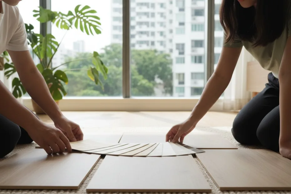
Identifying Undertones in Vinyl Flooring
The most common renovation mistake in Singapore is ignoring undertones. Wood-look vinyl isn’t just “brown”; it carries subtle hints of pink, yellow, blue, or grey. If you pair a yellow-toned floor with pink-toned walls, the space will feel muddy. You want to ensure your coordinating wall and floor colors share the same base temperature to maintain a professional aesthetic.
To identify these hidden colors, use the “white paper test.” Place a piece of bright white printer paper on top of your vinyl sample. Under natural light, the true undertone will immediately reveal itself against the pure white background. Cool tones will lean toward blue or grey, making them perfect for modern, crisp interiors. Warm tones will show hints of red, orange, or yellow, which are ideal for the “warm modernism” trend of 2026.
Color temperature significantly impacts your daily mood. Cool colors can make a small room feel larger and more refreshing, which is a major benefit in high-density HDB living. Warm tones create a cozy, inviting atmosphere. By masterfully aligning these temperatures, you control the emotional energy of your home. A professional installation ensures these choices are executed flawlessly, giving you peace of mind that your investment will look beautiful for years to come.
Optimizing Singapore Spaces: Lighting and Dimension Rules
Singapore’s geographical location presents a unique challenge for interior design. Unlike temperate climates where light is often soft and diffused, our tropical sun is intense and direct. This high-intensity light significantly alters how you perceive color within your home. When coordinating wall and floor colors, you must account for how midday glare can wash out subtle textures or how the lack of natural light in deep condo hallways can make a space feel subterranean. Understanding the interaction between light and surface area is the key to transforming a standard 3-room HDB into a space that feels as expansive as a 5-room flat.
A proven strategy for spatial optimization is the “Ceiling-Wall-Floor” gradient. Traditionally, designers suggest a light-to-dark transition to ground a room. However, in compact Singaporean apartments, a light-to-light approach often works better. By keeping the floor and walls within two shades of each other, you “erase” the visual boundary where the floor ends and the wall begins. This technique tricks the eye into seeing more floor area than actually exists. If you need professional home renovation advice on which specific tones work best for your layout, exploring expert design consultations can prevent costly color mismatches.
Expanding Small Rooms with Color
Maximizing a small footprint requires more than just light colors. It requires strategic verticality. While light floors are excellent for brightness, adding a slightly darker “feature” wall can actually add depth by creating a focal point that draws the eye inward. This prevents the room from looking like a flat, white box. Another professional secret involves your skirting boards. Matching your skirting to the floor color extends the floor’s visual reach, making the room feel wider. Conversely, matching the skirting to the wall color creates the illusion of higher ceilings. These small adjustments are foundational to Color Theory in Interior Design, ensuring every square inch of your home serves a purpose.
The Impact of Tropical Sunlight
The direction your windows face dictates your color palette. North-south facing units receive consistent, cooler light, while east-west facing units endure the “heat” of the afternoon sun. This orange-toned afternoon light can make warm wood-look vinyl appear overly red or yellow. To balance this, we recommend choosing “cool” greys or ash-toned vinyl. These shades neutralize the warmth of the sun, keeping your home looking crisp and modern.
- Midday Sun: Extremely bright light can make pale vinyl colors disappear. Choose a medium-depth grain to maintain texture.
- Artificial Lighting: Most Singaporean homes use a mix of “Cool White” and “Warm White” LEDs. Always test your vinyl samples under your specific home lighting, as “Cool White” bulbs will emphasize blue undertones in your flooring.
- Condo Hallways: These areas often lack windows. Use high-reflectance wall paint paired with light-toned flooring to prevent a “tunnel” effect.
By masterfully coordinating wall and floor colors with your specific lighting conditions, you ensure a professional result that remains beautiful from sunrise to sunset. Our experienced installation teams focus on these details to provide a seamless, high-quality finish for every renovation project.
The 4 Essential Color Pairing Strategies
Selecting the right combination for your home requires a strategic approach. Coordinating wall and floor colors is more than an aesthetic exercise; it is a way to define the function and mood of each room. Professionals rely on the Fundamentals of Color Theory to select pairings that either expand or anchor a space. By understanding how these two massive surfaces interact, you can avoid the common mistake of creating a disjointed or “muddy” interior.
The “Airy” approach, featuring light floors paired with light walls, remains the gold standard for modern Singapore BTOs. This combination reflects the maximum amount of light, making compact rooms feel significantly larger. It is the perfect foundation for the “warm modernism” trend of 2026, where soft whites and pale oaks create a serene, breathable environment. This strategy effectively erases visual boundaries, allowing your furniture to take center stage.
For formal living rooms, dark floors and light walls create a “Grounded” classic look. This pairing provides a sense of stability and luxury. The dark flooring acts as a visual anchor, while the light walls prevent the space from feeling heavy. This is particularly effective in homes with high ceilings or large windows where natural light is abundant. It creates a sophisticated contrast that feels both professional and inviting.
Feature walls thrive on the “Dramatic” strategy of light floors and dark walls. By keeping the floor light, you maintain a sense of openness, which gives you the freedom to experiment with deeper, moodier wall colors like forest green or rich charcoal. This adds immense depth to a room without the risk of making it feel cramped. It is an excellent choice for dining areas or home offices where you want to create a specific focal point.
Master suites in 2026 are increasingly leaning toward the “Intimate” look of dark floors and dark walls. While this may seem counterintuitive for small apartments, using consistent dark tones creates a cocoon-like, sophisticated environment that promotes rest. When executed with high-quality vinyl and professional carpentry details, this look rivals the world’s finest boutique hotels.
Tone-on-Tone vs. High Contrast
A monochromatic or tone-on-tone palette creates a seamless flow through the home. This is ideal for Japandi-style interiors where the goal is tranquility. To succeed here, you must vary your textures. If your vinyl flooring has a prominent grain, keep your wall finish smooth. High-contrast pairings, like charcoal vinyl against off-white walls, provide immediate visual energy and clear architectural definition. Be careful when colors are too similar but have different undertones; this can create a “box” effect that feels unintentional and flat.
Room-by-Room Recommendations
Practicality should always guide your design. In high-traffic kitchens, medium-toned wood grains are superior at hiding dust and hair compared to very light or very dark finishes. For bedrooms, comfort is king. Many homeowners find that vinyl flooring Singapore options provide the best balance of aesthetic versatility and underfoot warmth. Our professional installation services ensure these transitions between rooms are handled with precision, maintaining the integrity of your chosen color scheme and providing a high-quality finish that lasts.
Choosing Wall Colors for Specific Vinyl Textures
Texture adds a physical dimension that color alone cannot achieve. When coordinating wall and floor colors, the “business” of the vinyl grain is your primary guide. High-character wood looks, featuring heavy knots and deep grain variations, act as a visual focal point. To maintain balance, keep your wall colors simple and understated. A crisp off-white or a very light taupe allows the floor’s natural complexity to shine without overwhelming the room. This approach ensures your home feels curated rather than cluttered.
Grey-toned vinyl remains a staple for modern Singaporean homes, but the trend for 2026 is moving away from stark, cold greys toward “Greige.” This hybrid color bridges the gap between warm and cool tones perfectly. Pairing a grey-wash vinyl with a Greige wall creates a sophisticated, layered look that feels expensive. If you are using stone-look vinyl, which often has a cooler profile, consider adding warmth through your walls. Our carpentry services can install fluted panels in a matching timber tone to break up the coldness of stone finishes, providing a tactile contrast that looks professionally designed. To find the perfect match for your specific layout, consult our design experts for a personalized material selection.
The Herringbone Factor
Because herringbone flooring introduces a complex geometric pattern, your walls should provide a “quiet” backdrop. Too much color or texture on the walls can lead to visual overstimulation. We recommend using a matte or eggshell paint finish. These low-sheen options absorb light, which prevents the glare that often clashes with the subtle sheen of high-quality vinyl. This ensures the herringbone pattern remains the star of the show while the walls provide a calming, cohesive frame that adds to the room’s perceived value.
Wood-Look Vinyl and Earth Tones
The 2026 shift toward biophilic design makes earth tones a natural partner for wood-look vinyl. Deep Oak or Teak vinyl designs pair beautifully with sage greens, muted terracotta, and clay tones. This combination creates a “lived-in” warmth that is perfect for family living areas. For those pursuing a minimalist “Scandi” aesthetic, white walls paired with light ash vinyl provide a clean, high-contrast look that maximizes brightness. You can further enhance this by using wall paneling to introduce subtle vertical lines. This adds architectural interest without disrupting your carefully planned color palette. By masterfully coordinating wall and floor colors with these textures, you create a space that is both stylish and incredibly durable.
Expert Vinyl Installation: The Secret to Cohesion
The final step in coordinating wall and floor colors involves more than just selecting the right swatches. Professional installation is the bridge that connects your design vision to the physical reality of your home. Without expert precision, even the most expensive materials can look disjointed. Incorrectly placed planks or poorly matched transition strips create “color breaks” that disrupt the visual flow of your apartment. We prioritize a seamless finish to ensure your walls and floors look like they were designed to exist together from the very beginning.
A successful renovation relies on seeing colors in their true environment. This is why we emphasize the importance of free site assessments. Seeing a vinyl sample in a showroom is helpful, but seeing it “in situ” under your specific HDB or condo lighting is vital. Our experts bring samples directly to your space, allowing you to verify that your chosen floor perfectly complements your wall paint before a single plank is laid. With over 200 designs available, we provide the variety needed to find your perfect match, backed by the reliability of professional testing and quality standards.
Seamless Transitions and Thresholds
Managing the movement between different rooms is a hallmark of high-quality design. If you’ve chosen an airy, light-toned palette for your living room but prefer an intimate, dark scheme for the master suite, the transition point is critical. We use matching profiles and trims to create a high-end look that feels intentional. These small details prevent the “chopped up” feeling that often plagues DIY or low-quality renovations.
For a truly cohesive look, finishing details like skirting boards and custom carpentry must be handled with care. This is why working with a trusted carpenter in Singapore is vital. They ensure that built-in wardrobes and cabinets align perfectly with your coordinating wall and floor colors, creating a unified architectural statement rather than a collection of separate pieces.
Why Quality Matters for Color Longevity
Singapore’s intense UV exposure can be a silent enemy to your interior design. Over time, sunlight can cause inferior materials to fade, shifting the undertones of your floor and ruining your carefully planned color coordination. Our vinyl products are engineered with high UV resistance to maintain their original hue for years. This commitment to quality ensures a “risk-free” selection process, giving you peace of mind that your home will look as good in 2030 as it does on installation day.
Before you commit to your renovation, use this final checklist to ensure total cohesion:
- Verify Undertones: Do the floor and wall share a common temperature (warm vs. cool)?
- Test Under LED: Have you checked the pairing under both day and night lighting?
- Check Transitions: Are the threshold strips matched to the flooring for a seamless flow?
- Audit the Grain: Does the wall color remain simple enough to let the vinyl texture breathe?
By focusing on these professional installation standards, you protect your investment and ensure a high-quality finish that maximizes both style and space.
Transform Your Vision Into a Cohesive Reality
Aligning your interior surfaces is the most significant step in any home renovation. By mastering the art of coordinating wall and floor colors, you now have the professional tools to turn a standard apartment into a curated sanctuary. You’ve learned how to navigate tricky undertones and how to use Singapore’s unique tropical light to expand your visual square footage. These strategies ensure your home remains timeless, stylish, and perfectly balanced for years to come.
We’re dedicated to making your design journey risk-free and rewarding. Our specialized Singapore installation team provides the technical precision required for a high-quality finish, while our comprehensive warranties on all flooring offer long-term peace of mind. With over 200+ vinyl designs available, you’ll find the perfect texture and tone to match your lifestyle. Browse our 200+ vinyl designs and book a free site assessment today!
Your dream home deserves a professional touch. Start your transformation today and experience the confidence that comes with expert guidance and superior materials.
Frequently Asked Questions
Should the floor be darker or lighter than the walls?
A floor that is two to three shades darker than the walls is the standard choice for grounding a room. This creates a sense of stability and prevents the space from feeling top-heavy. However, in many Singaporean BTO flats, using a light floor with light walls is a professional strategy to maximize brightness. This “airy” approach is highly effective for making compact living areas feel significantly larger and more open.
Does grey vinyl flooring go with beige walls?
Grey vinyl flooring pairs beautifully with beige walls to create a sophisticated “greige” palette that is very popular in 2026. The secret to success lies in coordinating wall and floor colors by matching their undertones. You should pair a warm grey floor with a warm beige wall to avoid a clashing, muddy appearance. This combination offers a perfect balance between modern cool tones and traditional home warmth.
How do I match wood floors with wood furniture?
Avoid matching your wood furniture exactly to your flooring as this can make the room look flat and dated. Instead, aim for at least two shades of difference to create visual depth. If you have light oak vinyl floors, consider darker walnut or teak furniture to provide a professional contrast. Ensure both the floor and the furniture share the same undertone, such as yellow or red, to maintain a cohesive look.
What is the most popular floor and wall color combination in 2026?
The most popular combination for 2026 is the “Warm Modernism” look, which features light ash or oak vinyl paired with soft off-white or muted sage green walls. This trend focuses on biophilic elements and natural textures. It provides a serene, lived-in feel that works perfectly with the Japandi aesthetic. Homeowners are increasingly choosing these earthy palettes to create a relaxing sanctuary away from the busy city environment.
Can I use the same color for both floors and walls?
You can use the same color for both surfaces to achieve a high-end monochromatic look, but you must vary the textures. For example, pair a light grey wood-grain vinyl floor with a smooth, matte grey wall. This prevents the “box” effect where the room feels closed in. Using different materials in the same color family adds architectural interest while maintaining the seamless, professional flow that many modern renovations aim for.
How does floor color affect the size of a room?
Floor color is a powerful tool for changing the perceived dimensions of a space. Light colors reflect more light, which pushes the boundaries of the room outward and makes it feel more spacious. Darker floors absorb light and pull the space inward, creating an intimate and cozy atmosphere. For small HDB apartments, light-toned vinyl is often the best choice for creating a bright and airy environment.
What wall color goes best with light oak vinyl floors?
Light oak vinyl floors are incredibly versatile and pair best with crisp whites, cool greys, or soft earth tones. If you want a modern Scandi look, choose a bright white wall paint. For a warmer, more traditional feel, muted terracotta or clay tones work exceptionally well. These combinations highlight the natural beauty of the oak grain without competing for attention, ensuring your coordinating wall and floor colors look professionally curated.
Do I need to match my skirting boards to my floor or wall?
Matching skirting boards to your floor color is a professional trick to make the floor area appear larger. This extends the visual reach of the vinyl and is ideal for small rooms. Conversely, matching skirting boards to your wall color makes the walls look taller, which is great for homes with lower ceilings. Both approaches are valid, but they serve different spatial goals depending on your specific apartment layout.